
IBM blasted Selectric typeballs with walnut shells because sand was too rough
A manufacturing detail behind the office icon explains why changing the alphabet involved more than swapping metal letters.
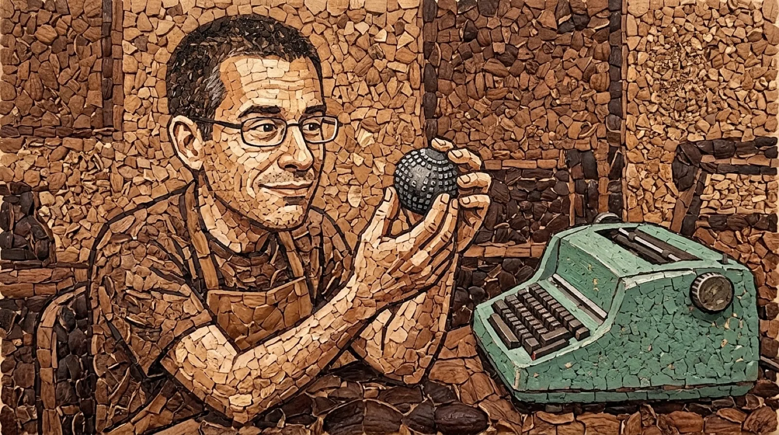
IBM put the alphabet on a moving ball, then had to find something gentle enough to clean the thing. The answer was walnut shells. Apparently getting a clean typeface sometimes requires going a little nuts, with the abrasive doing rather less damage than sand would have done.
The company’s Selectric history describes a molded plastic element that was deburred with shells and then chrome-plated for durability. That sequence is worth keeping intact. The familiar shiny ball did not begin as a solid metal object, and the shell treatment was a manufacturing step rather than a home maintenance recommendation.
The ball replaced a collection of individual type bars. It tilted and rotated to put the chosen character against the page, allowing the paper to stay in place while the printing element traveled. The design attacked two familiar irritations at once: type bars colliding and a moving carriage helping paper drift out of alignment.
A replacement ball could also change the available typeface. The Selectric made that change physical: the alphabet lived on a removable part. Buying another font meant obtaining another object that had to strike the page correctly, rather than selecting a different name in a menu and hoping the document would look the same on somebody else’s machine.
The manufacturing detail makes the convenience less mysterious. Tiny raised letters need clean edges, but cleaning must leave those edges intact. A rougher abrasive would solve the burr problem by creating a new problem in the part that actually prints. The right material for the cleanup step becomes part of the typography, even though the typist never sees it.
IBM’s account also describes adjustments to the letters themselves because the element struck differently from older type bars. The output depended on the entire chain: the material, the surface treatment, the character shapes and the mechanical movement. A recognizable letter came from those decisions cooperating on a sheet of paper.
That is useful context for anyone restoring one now. A shiny replacement element and a machine that powers on are only pieces of the experience. The story gives a reason to care about the condition of the printing surface, without pretending an old factory technique is a repair procedure to reproduce on the kitchen table.
It also shifts the nostalgia away from a generic admiration of heavy old office equipment. The cleverness is in choosing what should move and what should stay still, then getting a delicate little alphabet through production. The corporate history gives the walnut shells only a short passage, but they explain why the shiny finished part could do its job without arriving sanded into disappointment.
A tough act to type.