
The Mac’s Command symbol came from a Swedish sign after Steve Jobs objected to Apple logos
Andy Hertzfeld recalls Susan Kare finding the symbol in a dictionary and drawing it as a 16-by-16 bitmap. His page also preserves a correction about the sign.
The Macintosh once put a little Apple logo beside each menu item with a keyboard shortcut.
Hertzfeld recalls Jobs protesting, “We’re taking the Apple logo in vain!” The objection sent Susan Kare looking for a replacement.
The page’s title calls it a Swedish campground symbol. A correction Hertzfeld preserved from Lennart Olson says its Swedish traffic-sign meaning is a historic site. That correction is part of the account, too; the charming version needs the footnote.
The original plan made the relationship between menu and keyboard explicit. Holding the corresponding key and pressing another key selected the menu command. The logo was doing actual instructional work, repeated wherever that relationship needed to be shown.
Longer menus made the repetition harder to miss. Hertzfeld recalls Jobs arriving upset after apparently seeing MacDraw. His objection put the team on a short deadline because the mark also affected printed manuals and keyboard hardware. A little icon in a menu had become a decision involving multiple things that would be expensive to change later.
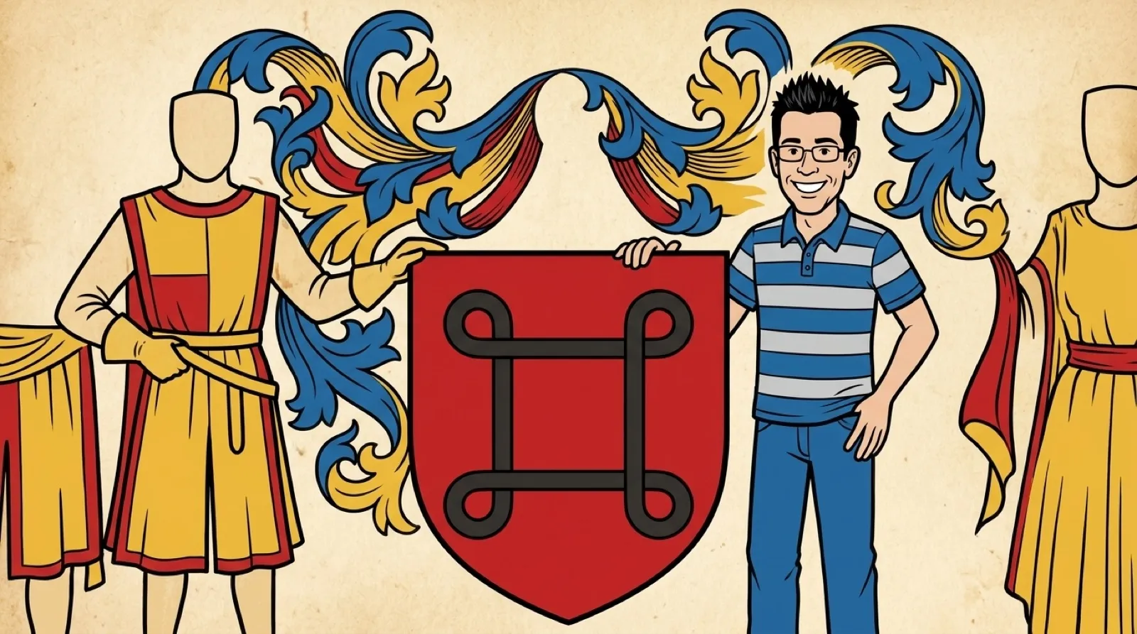
Kare’s symbol dictionary gave her somewhere concrete to look. Hertzfeld describes her search for a small mark that would be distinctive, attractive and connected somehow to a menu command. The Swedish attraction symbol supplied a recognizable shape without putting the corporate logo on every eligible line.
She rendered it as a 16-by-16 bitmap. That resolution makes the design problem easier to picture: every bend needed to survive a tiny grid. A beautiful drawing that collapsed at menu size would have failed both locations where the symbol had to work. The team accepted the bitmap, and the same outline could identify the key itself. Consistency mattered because an icon meant to save a trip through the menus would be a poor shortcut if it sent the user hunting across the keyboard.
For a present-day interface, the useful test is a shortcut viewed in context. Does the symbol remain distinguishable beside text, and can someone find its matching key? A menu icon and the physical control should be reviewed together, just as the old decision reached both software and hardware.
There is also a limit to what this recollection establishes. It records Hertzfeld’s account of how the Macintosh team chose its symbol. It does not require a claim that Apple invented the shape or that every later user knows its Swedish connection. The interesting unresolved part is how many familiar interface marks are still carrying a similarly unfamiliar earlier life.
Hertzfeld’s story leaves a useful question for the next interface redesign: which familiar mark can survive the smallest place it has to appear?