
MoMA preserves 176 emoji built from twelve-by-twelve pixel grids
A telecom employee trained in economics wanted mobile messages to carry everyday tone, then paid his own way to see his work exhibited in New York.
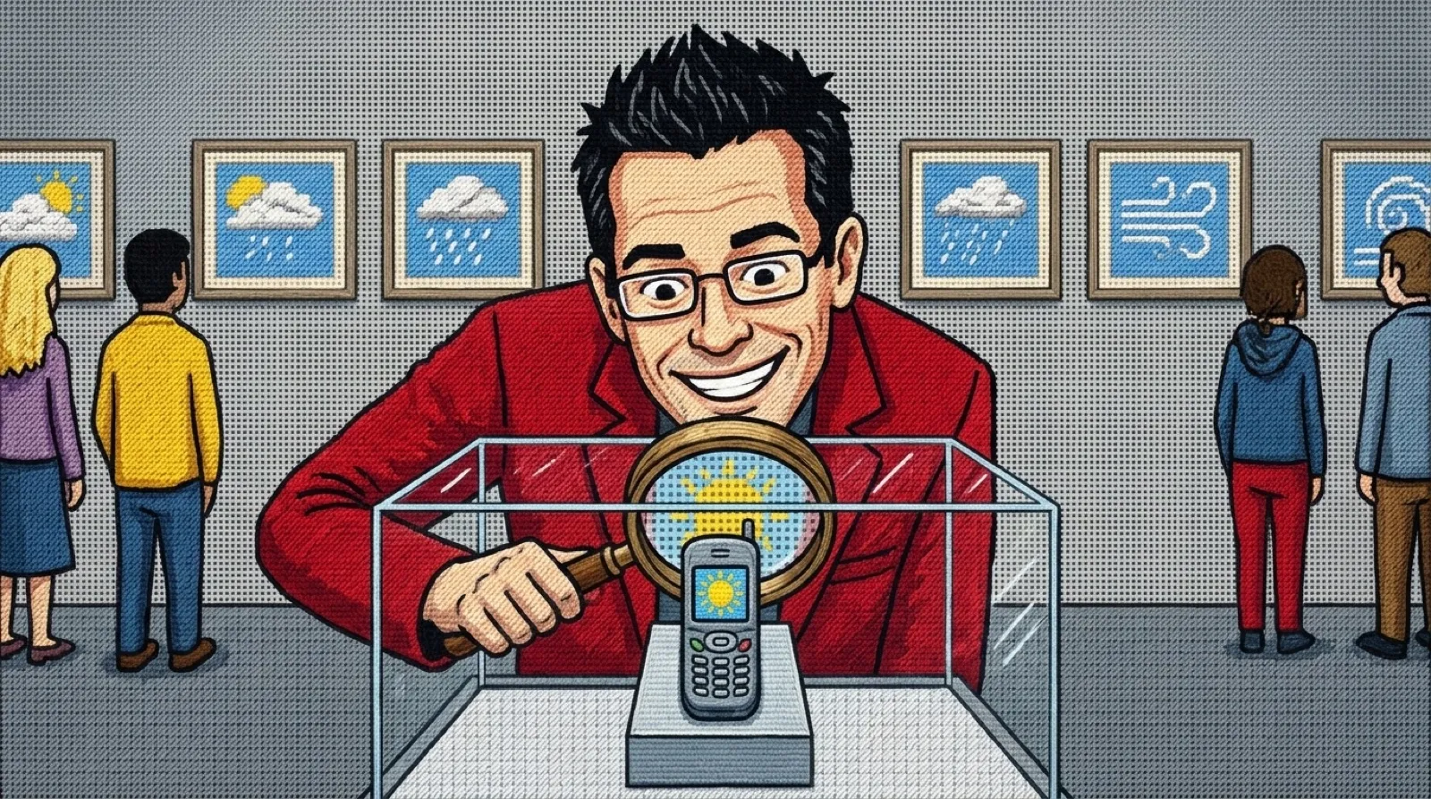
Shigetaka Kurita had 144 pixel positions in which to draw a feeling. The set MoMA acquired dates to 1998–1999, when mobile messages had much less room for explanation and a misplaced tone couldn’t be repaired with a voice memo.
Kurita was working at NTT DOCOMO on i-mode, its mobile internet service. In Yuri Kageyama’s Associated Press interview, he recalled the problem behind the drawings: messages were limited to 250 characters. The service needed shorthand that could also make an abrupt question feel less abrupt. The same request for someone’s whereabouts can sound friendly or nosy; a tiny face supplies a clue about which one was intended.
The employee doing this wasn’t a trained graphic designer. ABC’s Rachel Mealey interviewed Kurita and reported that he had studied economics, with no design or programming experience. He divided the job into media, services and emotions, then pared his list down to things someone carrying a phone would need during daily life. That’s a more useful starting point for an interface than drawing everything the software can technically display.
MoMA’s exhibition account places the release in 1999, with 176 symbols for phones and pagers. It identifies manga, Zapf Dingbats and existing text emoticons among Kurita’s influences. Weather, places and expressions shared the same tiny allotted square. There was no room for the detail that makes a large illustration impressive, and no advantage in adding it if the reader couldn’t see it.
The grid also imposed a practical test on every design. A sun had to read as a sun beside a message, where nobody was stopping to admire the pixel arrangement. Enlarging one until it fills a museum wall lets you inspect its construction, but the hard part was making it legible before anyone could inspect it.
Some pictures traveled better than others. AP reported five simple faces expressing happiness, anger, sadness, surprise and perplexity. It also recorded a delightful failure: people mistook a camcorder for a fish. A small drawing can save characters while sending the reader toward completely the wrong noun. The icon understood by its designer still has to survive someone else’s eyes.
Kurita’s own favorites included the smile and heart. “The heart is the reason why we decided to make emoji in the beginning,” he told ABC. A symbol could soften the words around it without asking the sender to explain their emotional state in another paragraph. Anyone who has reread an unfortunately terse text can appreciate the appeal.
The museum visit brought its own constraint. ABC reported that Kurita received his company salary for the work, with no extra earnings from the symbols, and paid for the trip to New York with his wife. They stayed only two nights because accommodations cost too much. A creation could find a permanent museum home while its creator still had to watch the hotel bill.
A future interface with more animated faces and sharper displays will still face Kurita’s fish problem. More pixels can describe the object better, but they don’t establish what a particular reader thinks it means. For a save button, warning or payment confirmation, pairing the picture with words gives the designer another way to check comprehension before the symbol has to work alone.
MoMA preserves the digital files as well as the story of their arrival. What a future reader recognizes in those little squares will depend on which objects, habits and visual shortcuts remain familiar by then.