Apple explained printer settings with a font animal that became the dogcow
Mark Harlan’s firsthand Apple account preserves both the useful interface trick and the argument over who named the creature.
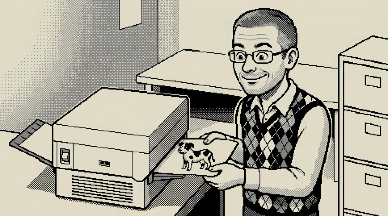
Apple put an animal in the printer settings, and people argued over its species. The useful part was already working: a creature with an obvious orientation could show what a print option would do before anyone sacrificed another sheet of paper.
Mark Harlan’s firsthand history, originally published in Apple’s develop journal and preserved in this mirror, credits Susan Kare with the Cairo-font character. He remembers encountering it in the LaserWriter Page Setup Options dialog during his Developer Technical Support work.
The little figure gave print transformations a visible consequence. An inverted image or a changed print area became something you could inspect. The preview supplied the missing demonstration while the setting’s label handled the name. An entire argument with a printer, reduced to one small animal (a public service).
Harlan calls that “perfection in human interface design.” That is his judgment, and the reason matters more than the compliment. The image had enough recognizable structure for a transformation to reveal itself. A symmetric blob would have been much less helpful.
The naming anecdote is messier than the icon. Harlan recounts pressing Scott Zimmerman over whether the animal was a dog or a cow. Zimmerman’s answer combined the two. Harlan dates that exchange to October 15, 1987, while also recording that others credited Ginger Jernigan with using the term shortly beforehand.
That acknowledgment belongs in any retelling. The source itself leaves room for competing memories, so a clean declaration of one inventor would make the story less accurate for the sake of a tidier trivia card. Even the dogcow refuses to stay inside one category.
Harlan also describes turning its sound into a hybrid greeting and circulating the image internally. A functional bit of interface acquired a social life among the people using and supporting it. Nobody had to schedule a brand activation for the printer dialog’s livestock.
For anyone designing settings now, the practical experiment is straightforward. Show a sample with a recognizable top, bottom and direction. Change the option. Check whether someone can describe the result without reading the explanation twice. A good preview lets the reader spend attention on their own document rather than on deciphering your controls.
A preview also needs to match the operation it represents. A memorable mascot cannot excuse an inaccurate demonstration, any more than a friendly progress bar can print a missing page. Personality helps when it carries information; decoration alone leaves the original confusion intact.
That could be the most useful part of this odd little Apple story. A software interface can teach through the behavior of one visible object, and people may remember the object long after the dialog disappears. The historical record still cannot give the creature one uncontested naming certificate.
The printer had a pet.